You might have thought: why does a Dutch girl write a blog in English about English books? It's really simple: I just majorly favour English books for a ton of reasons. They look better, there are more of them, Dutch literature is always a bit weird.. et cetera. When I look at my bookcases, I always get a warmer feeling from the left one - the English one - than from the right one - the Dutch one. It looks more colourful, but also calmer, because all the books are the same size. The sizes of Dutch books go everywhere, and the spines are most of the time in one colour, with a very formal font for the title. Boring!
So let's gush about some covers...
One of the covers I love most is the one from The Book of Lost Things, by John Connolly:

This book just looks so attractive! However, it has not been translated to Dutch, so we have nothing to compare it with. Let's move on to a book I just finished:


Don't you think that the purple colour of the Dutch version is just a bit off? Compared to the English one, it's too light, not intense enough. Not for such an intense story anyway. And, like I said above: the formal font. A very normal sans serif.


I am not a big fan of the English cover of Outlander, but the Dutch one is just.. ugh. Like it is a romance novel! I mean, there is a lot of romance going on, but what about the war, the 18th-century Scots? It is a tough book as well, not some kind of chick flick!


Have you read this book? This book is fun! Like the English cover, which also looks like fun. Not like the Dutch one, which looks boring (again, the formal font...)
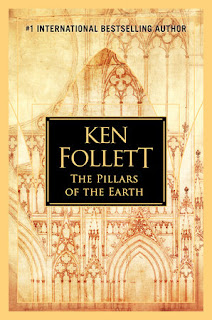


This is a great book about building a cathedral. A beautiful, large, slender cathedral, with stained glass windows and ornaments and gothic windows. Like on the English covers, full of wonderful details. Dutch people: let's put a castle-like entrance of a monastry and a dead tree on the front, ok?
When I'm in a bookshop, I reach for the books that look attractive to me, as that is the first sense that you use. I never heard of someone who is going to a bookshop and starts to read all the blurbs, starting left of the top shelf, waiting for a blurb that sounds interesting. We first pick with our eyes. John Connolly, the author of The Book of Lost Things, totally agrees on this one with me:
So let's gush about some covers...
One of the covers I love most is the one from The Book of Lost Things, by John Connolly:
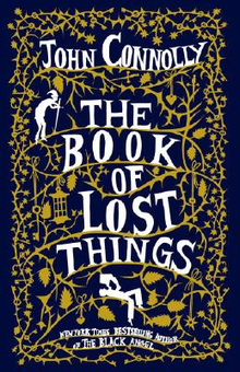
This book just looks so attractive! However, it has not been translated to Dutch, so we have nothing to compare it with. Let's move on to a book I just finished:


Don't you think that the purple colour of the Dutch version is just a bit off? Compared to the English one, it's too light, not intense enough. Not for such an intense story anyway. And, like I said above: the formal font. A very normal sans serif.


I am not a big fan of the English cover of Outlander, but the Dutch one is just.. ugh. Like it is a romance novel! I mean, there is a lot of romance going on, but what about the war, the 18th-century Scots? It is a tough book as well, not some kind of chick flick!


Have you read this book? This book is fun! Like the English cover, which also looks like fun. Not like the Dutch one, which looks boring (again, the formal font...)


This is a great book about building a cathedral. A beautiful, large, slender cathedral, with stained glass windows and ornaments and gothic windows. Like on the English covers, full of wonderful details. Dutch people: let's put a castle-like entrance of a monastry and a dead tree on the front, ok?
When I'm in a bookshop, I reach for the books that look attractive to me, as that is the first sense that you use. I never heard of someone who is going to a bookshop and starts to read all the blurbs, starting left of the top shelf, waiting for a blurb that sounds interesting. We first pick with our eyes. John Connolly, the author of The Book of Lost Things, totally agrees on this one with me:
The old adage suggest that one should never judge a book by its cover, but this is true of most things except books. As readers, we are frequently drawn to take a book from a shelf precisely because the cover has attracted our attention.What's your (least) favourite cover? Let me know in the comments :)
Comments
Post a Comment